Well I had such fun this week experimenting with visual identities for Glitchpuke! This was an assignment in the self-management/promotion class I’m taking in the Conservatorium van Amsterdam. We were asked to assemble images that we intuitively liked.

Some things were immediately obvious when I saw my selection all together.
1) I like computer games
2) I like psychedelic colours but not psychedelic iconography (no Jimi Hendrix posters or images of mushrooms)
3) I like some abstract and glitchy graphics, as long as they’re not too clean/abstract (no 3D fractals here, for instance) and not too glitchy/noisy (no “databent” photos or videotape or TV-screen distortions)
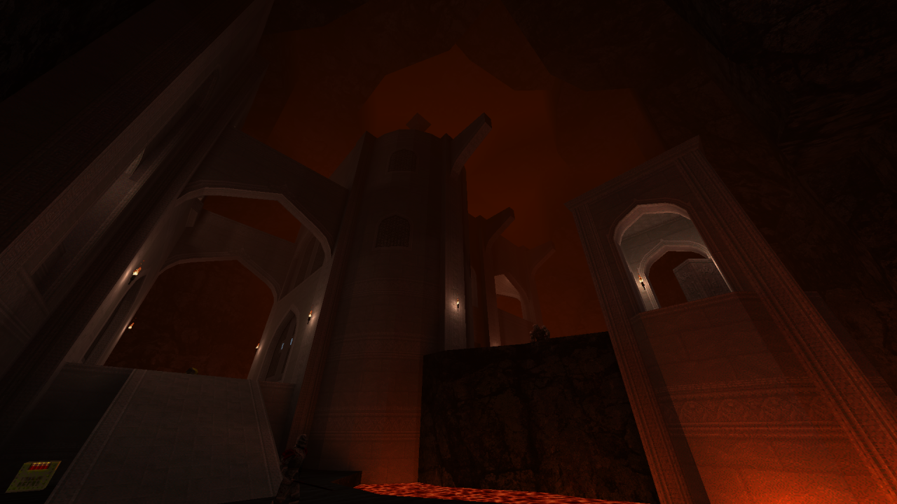
There are also some repeated visual traits… flat areas of dark grey, limited palettes, textures both computer-generated and natural, atmospheric gradients, and (especially in the computer game images) radial and diagonal lines.
I learnt that I really, really like hazy gradients with pink! For instance this painting by the great 70s sci-fi/fantasy illustrator Bruce Pennington:
 But my favourite complete palettes seemed to be dominant dark grey with some warm accents:
Though I also really like very intentional and artificial colour schemes (psychedelia again). Check out more of artist Troy Paiva’s great work at http://lostamerica.com/:


I made the palette using the colour extraction tool at http://labs.tineye.com/color/ – try it!
I’m not sure yet if these colour schemes are the right way to go for Glitchpuke, but I can certainly recommend assembling 15 pictures you like, making collages and seeing what turns up!
